That distinction matters if your goal is to reproduce the visual character accurately rather than simply find a pink font that looks vaguely similar.
This guide explains the fonts associated with Legally Blonde’s visual identity, how to find suitable alternatives, how to recreate the look responsibly, and which typography choices work best for modern creative projects.
What Font Is Used for Legally Blonde?
The answer depends on which Legally Blonde design you are referring to.
For the Legally Blonde musical logo, font references identify Trajan as the primary typeface. Font identification resources also associate the smaller “The Musical” lettering with a brush-script style known as Las Vegas Fabulous.
For the 2001 Legally Blonde film poster, another font identification source identifies Compacta as the typeface used for the prominent poster text.
This means that searches for “Legally Blonde font” can produce different answers because people may be looking at different pieces of franchise artwork.
Trajan: The Typeface Associated With the Musical Logo
Trajan is a classic display serif typeface created as part of Adobe Originals. Adobe describes its design as being inspired by Roman letterforms, particularly the inscription associated with Trajan’s Column in Rome. The original typeface was designed by Carol Twombly in 1989.
Its formal capital letters, strong vertical structure, and classical proportions give it a polished theatrical quality. Those characteristics make it particularly effective for large display typography.
Trajan is not a novelty “movie font.” It is a professionally developed type family that has been used across books, posters, billboards, branding, and other display applications. Adobe specifically describes it as suitable for display work.
Why Trajan Works for the Legally Blonde Look
At first glance, Trajan may seem more traditional than the playful personality associated with Elle Woods. That contrast is part of what makes the typography interesting.
The classical letterforms create a polished, almost academic quality, while the surrounding visual identity can introduce the bright, fashionable, youthful character associated with Legally Blonde.
This combination is useful for designers who want a sophisticated headline with a playful visual environment.
What Is Compacta?
Compacta is another typeface associated with Legally Blonde’s film-poster typography. Font identification references describe the poster lettering as being created with Compacta, a condensed display typeface originally designed by Fred Lambert and published by ITC.
Its narrow proportions allow large words to occupy relatively little horizontal space. That makes condensed display type especially useful for movie posters, headlines, covers, and other layouts where the title needs to dominate without taking up the entire canvas.
If the version of the Legally Blonde typography you are trying to recreate has tall, tightly packed letters, Compacta may therefore be a more useful starting point than Trajan.
Legally Blonde Font vs. Legally Blonde Style
One of the biggest mistakes when searching for a movie-inspired font is focusing entirely on the typeface while ignoring the surrounding design system.
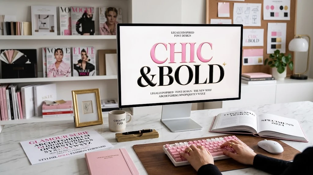
The recognizable Legally Blonde aesthetic comes from the combination of typography, color, composition, fashion, imagery, and personality.
For example, a designer can use an appropriate serif or condensed display font but still produce an entirely different result by choosing muted colors, heavy shadows, or an unsuitable layout.
If your goal is to capture the visual feeling rather than duplicate a specific logo, think about these elements together:
- Bold display typography
- Strong uppercase lettering
- Clean spacing and alignment
- Pink and fashion-oriented visual accents
- High-contrast layouts
- Polished editorial presentation
- Playful supporting graphics
- Confident, youthful visual energy
How to Choose a Legally Blonde Font Alternative
You do not always need the exact typeface to create a convincing design inspired by the aesthetic. In many projects, a carefully selected alternative can deliver a similar mood while giving you more flexibility.
Look for the Right Letter Structure
Start by examining the characteristics you want to reproduce.
If you prefer the classical appearance associated with Trajan, look for an elegant uppercase serif with distinctive capitals and a refined structure.
If you are recreating the more condensed poster appearance associated with Compacta, search for a narrow display sans-serif or condensed headline font.
Consider the Width
Font width can dramatically change the appearance of a headline.
A wide typeface may require several lines to fit a title, while a condensed typeface can keep the same words together on a single line.
For poster design, condensed fonts can be particularly useful because they allow the title to remain visually dominant without overwhelming the composition.
Check the Capital Letters
Many display treatments depend heavily on uppercase letterforms. Pay attention to the shape of A, R, G, S, M, and other distinctive characters.
Two fonts may have similar widths but completely different personalities because their capital letters are constructed differently.
Is the Legally Blonde Font Free?
Not necessarily. A font’s availability and licensing depend on the specific typeface and the source from which you obtain it.
Trajan is part of Adobe’s font ecosystem, and Adobe provides licensing information for using fonts through Adobe Fonts. Adobe states that its Adobe Fonts library is cleared for personal and commercial use under its applicable service terms.
However, that does not mean you should download a random file labeled “Legally Blonde font” from an unofficial website and assume that it is licensed for every purpose.
When a font is used for a commercial logo, product packaging, merchandise, advertising, or a client project, check the license associated with the actual font file or service you are using.
Where Can You Find Trajan?
Adobe provides an official Trajan family page where designers can review the typeface and its available styles.
The typeface is also available through commercial font marketplaces, where licensing options can vary according to the intended use.
Using a legitimate font source is preferable to downloading an unknown copy because licensing terms, file integrity, and available styles can differ between sources.
Can You Use the Legally Blonde Logo or Font for Commercial Projects?
Using a typeface and using a movie’s trademark or logo are two different questions.
Legally Blonde is a registered trademark associated with Metro-Goldwyn-Mayer Studios Inc.
That means a designer should not assume that finding the correct typeface gives them permission to reproduce official franchise branding, logos, artwork, or other protected material for commercial purposes.
If you are creating fan art for personal use, your situation may differ from creating products, advertising, merchandise, or branded materials intended for sale. For commercial work, review the applicable intellectual-property rights and obtain permission or licensing when necessary.
How to Recreate the Legally Blonde-Inspired Look
If you are designing an original project inspired by the general aesthetic, you can build a similar mood without copying the official logo.
1. Start With a Strong Display Font
Choose either a refined serif or condensed display face depending on the specific look you want.
Trajan is a natural reference when you want an elegant, classical headline. A Compacta-style condensed face works better when you want a tall and narrow poster treatment.
2. Use a Confident Color Palette
Pink is strongly associated with the Legally Blonde visual identity, but simply making every element bright pink can quickly make a design feel amateurish.
Instead, use pink as an accent alongside white, black, cream, soft neutrals, or carefully selected complementary tones.
3. Create Clear Typography Hierarchy
Use one dominant headline, a supporting subtitle, and smaller secondary information. Avoid putting every word at the same size.
A strong hierarchy makes a design feel intentional and gives the viewer an obvious starting point.
4. Give the Headline Space
Display fonts often look better when they have room around them. Crowding a large title against other elements can make the design feel less polished.
5. Keep Supporting Elements Simple
Fashion-inspired accessories, subtle patterns, handbags, sunglasses, stationery, or academic motifs can support the concept without competing with the headline.
Best Font Styles for a Legally Blonde-Inspired Design
| Font Style | Best Use | Visual Character |
|---|---|---|
| Classical serif | Elegant titles and editorial graphics | Polished and sophisticated |
| Condensed display | Posters and large headlines | Tall, bold, and dramatic |
| Brush script | Accents and short phrases | Playful and expressive |
| Modern sans-serif | Supporting text | Clean and contemporary |
| Fashion editorial serif | Luxury-inspired layouts | Refined and stylish |
Legally Blonde Font for Canva
If you are creating a design in Canva, you may not have access to every commercial typeface. Instead of searching for an exact franchise font, focus on matching the typography characteristics.
For the classical look, search for an elegant uppercase serif. For the movie-poster effect, look for a condensed display font. For handwritten or playful supporting text, explore brush-script or casual script options.
The important thing is to compare the overall shape of the letters rather than choosing a font simply because its name contains “blonde” or “pink.”
Legally Blonde Font for Photoshop and Illustrator
Professional design software gives you more control over typography than many template-based design platforms.
In Photoshop or Illustrator, you can adjust tracking, kerning, scale, alignment, effects, and layering to create a more controlled display treatment.
For example, a condensed headline can be combined with generous tracking in selected areas, while a classical serif can be presented with careful spacing and a clean baseline.
Adobe’s official Trajan page also provides information about using the family in design projects and website publishing through Adobe Fonts.
Typography Tricks That Improve the Look
Use Tracking Carefully
Letter spacing can change the personality of a headline. Too little spacing can make large capitals feel crowded, while too much can destroy the visual connection between letters.
Test Multiple Weights
A bold version may work better for a poster title, while a regular weight can create a more refined editorial appearance.
Use Alignment as a Design Tool
Centered type can create a formal poster feel, while left-aligned typography often feels more editorial and contemporary.
Avoid Excessive Effects
Drop shadows, bevels, outlines, and glowing effects can quickly overwhelm a classic display font. Start with clean typography and add effects only when they genuinely improve the design.
Common Mistakes When Searching for the Legally Blonde Font
Assuming There Is Only One Font
Different Legally Blonde artwork can use different typefaces or lettering treatments. The film poster and musical logo are useful examples of why identification depends on the exact artwork being examined.
Downloading Unlicensed Fonts
A font appearing in a search result does not automatically mean it is free for commercial use. Always check the licensing terms before using it in a paid project.
Copying the Official Logo
Recreating a general typography style for an original design is different from presenting your work as official Legally Blonde branding. The franchise name and associated branding are protected intellectual property.
Using Too Many Fonts
A strong design normally needs only a small number of typefaces. One display font paired with a clean supporting font is often more effective than five unrelated choices.
How to Make Your Design Feel Inspired but Original
If you want the recognizable energy of Legally Blonde without copying official artwork, combine familiar design cues with your own concept.
- Choose an elegant or condensed headline typeface.
- Build your own color palette instead of copying an exact logo treatment.
- Use original photography or illustrations.
- Create a new headline rather than reproducing movie branding.
- Experiment with modern spacing and composition.
- Use fashion or academic themes only when they support your own concept.
- Keep the final design recognizable as your work rather than a replica.
This approach is especially useful for social media graphics, blog headers, presentations, invitations, mood boards, and other creative projects.
Legally Blonde Font Inspiration for Designers
Typography works best when it is considered part of a larger visual system. The same principle applies to other design-focused projects, whether you are developing a sports identity, fashion concept, digital graphic, or creative product.
For example, PostTrek’s article about a baseball lifestyle logo provides another example of how typography can contribute to a broader identity rather than functioning as an isolated decorative element.
Likewise, visual projects involving PNG graphics demonstrate why image treatment and typography often need to work together.
Fashion-focused concepts can also benefit from deliberate type choices. Our coverage of women’s steampunk fashion illustrates another design environment where typography, visual identity, and styling can influence one another.
Frequently Asked Questions
What font is the Legally Blonde musical logo?
Font identification resources commonly identify Trajan as the primary typeface for the Legally Blonde musical logo, with a brush-script style used for the “The Musical” portion.
What font was used for the Legally Blonde movie poster?
The 2001 film poster has been identified by font-reference sources as using or closely matching Compacta for its prominent lettering.
Is Trajan the official Legally Blonde font?
It is more accurate to say that Trajan is a typeface associated with the musical’s logo rather than describing it as one universal official font for every Legally Blonde design.
Who designed Trajan?
Adobe identifies Carol Twombly as the designer of the original Trajan typeface, released through Adobe Originals in 1989. Adobe’s current Trajan family information also credits Robert Slimbach on the family.
Can I use the Legally Blonde font commercially?
The answer depends on the specific font license and what you are creating. Using a licensed typeface is separate from using Legally Blonde trademarks, logos, or copyrighted artwork. Commercial projects should be reviewed for both font licensing and intellectual-property considerations.
Is there a free Legally Blonde font?
There are free fonts that can create a similar aesthetic, but a free lookalike is not necessarily the actual typeface used in franchise artwork. Always check the license before using a font commercially.
What is the best alternative to the Legally Blonde font?
For a classical display look, start with a Trajan-like serif. For the tall poster appearance, a Compacta-style condensed display face is a better direction. The best choice depends on which piece of Legally Blonde artwork you are trying to emulate.
Final Thoughts
The Legally Blonde font is best understood as a typography question with more than one answer. Trajan is strongly associated with the musical logo, while Compacta has been identified with the lettering used in the 2001 film poster.
For designers, the most useful approach is to identify the exact visual treatment you want before choosing a typeface. Look at letter width, capital shapes, weight, spacing, and overall composition rather than searching for a font simply because it has “Legally Blonde” in its name.
Whether you are designing a poster, social graphic, presentation, invitation, or original fashion-inspired concept, the right combination of typography, spacing, color, and composition can capture the confident visual energy associated with the franchise while keeping your own creative work distinctive.